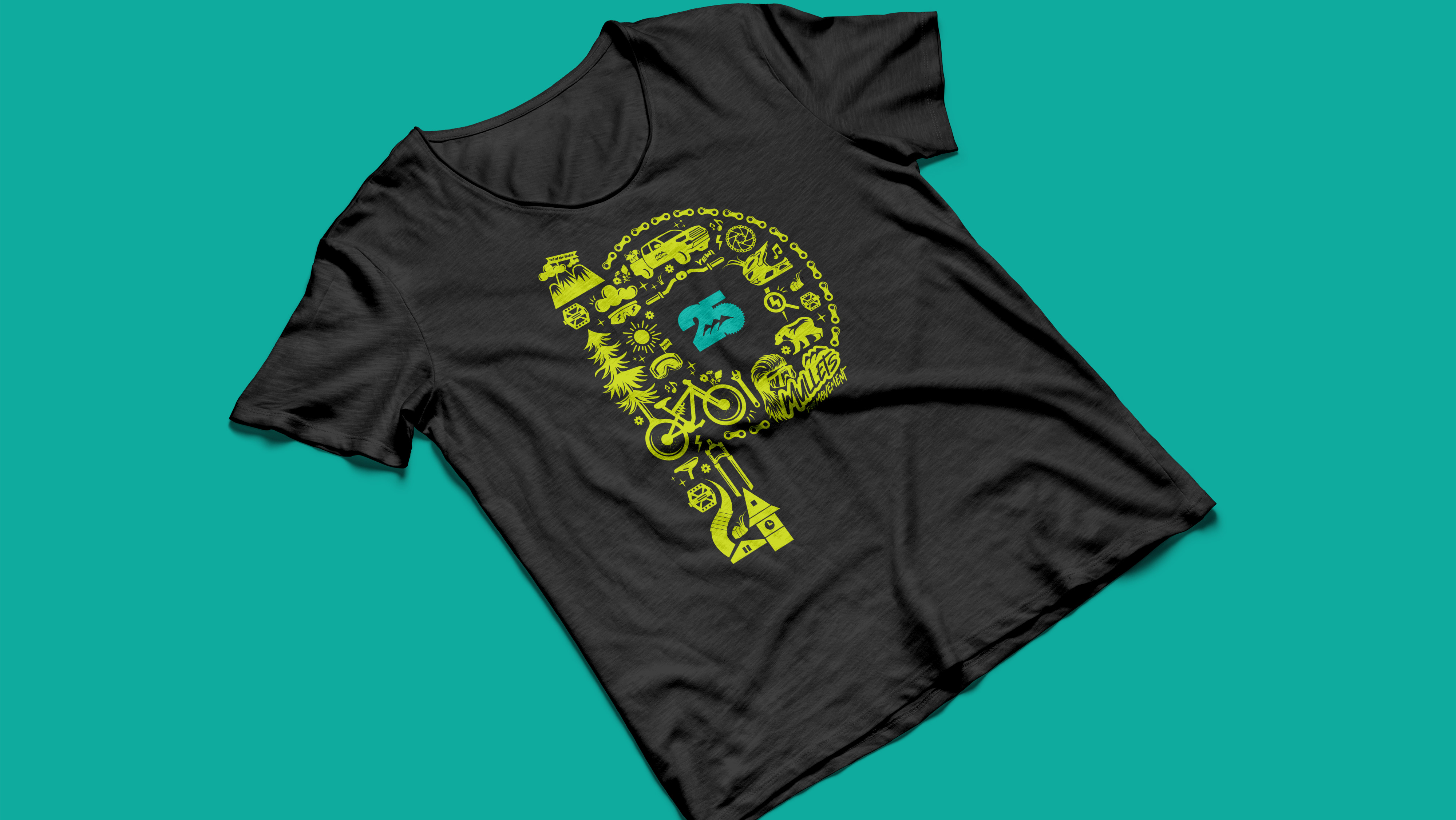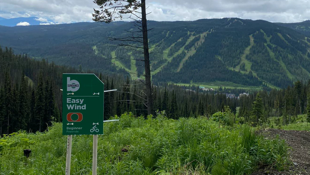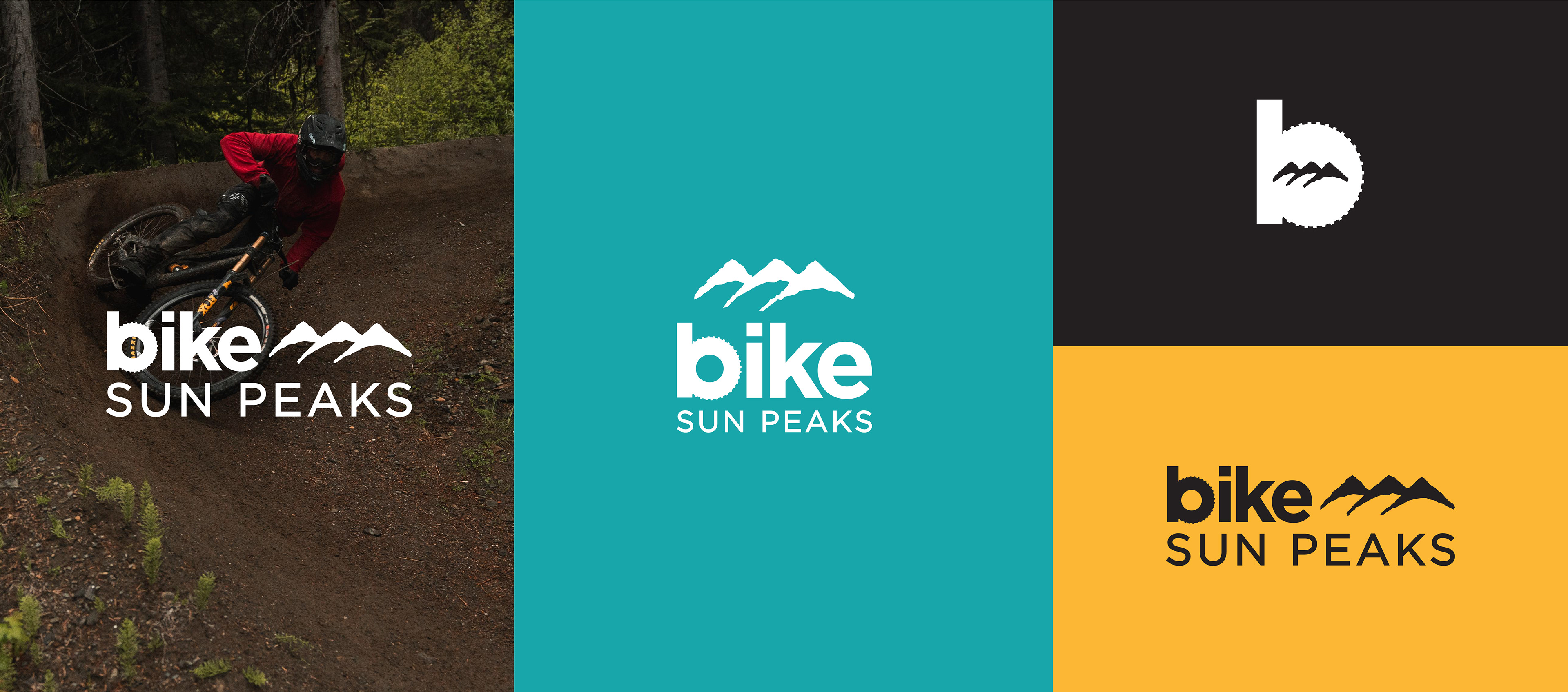
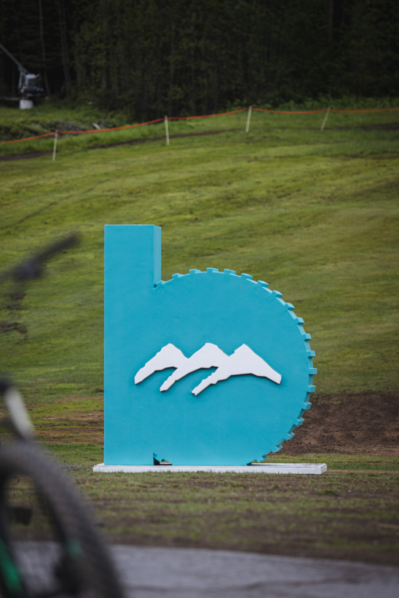
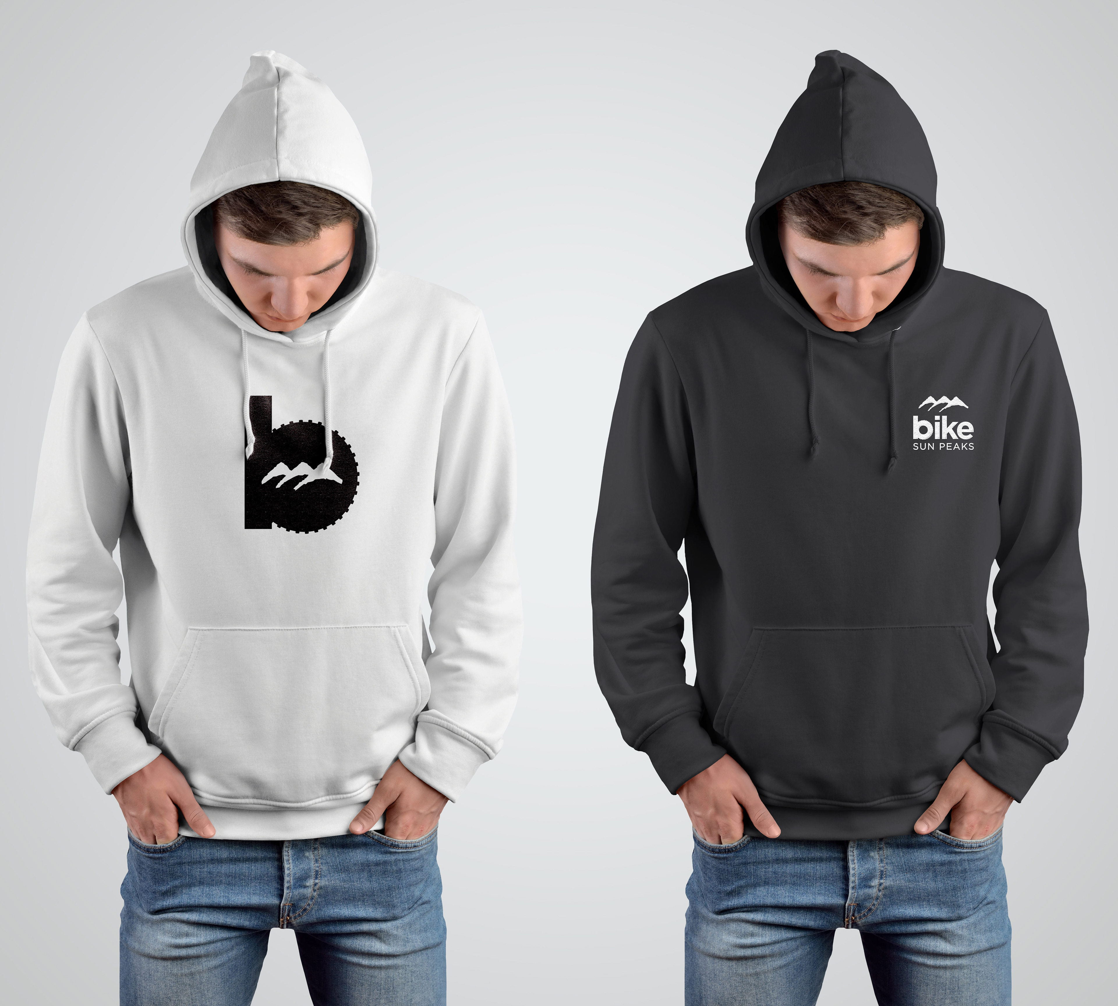

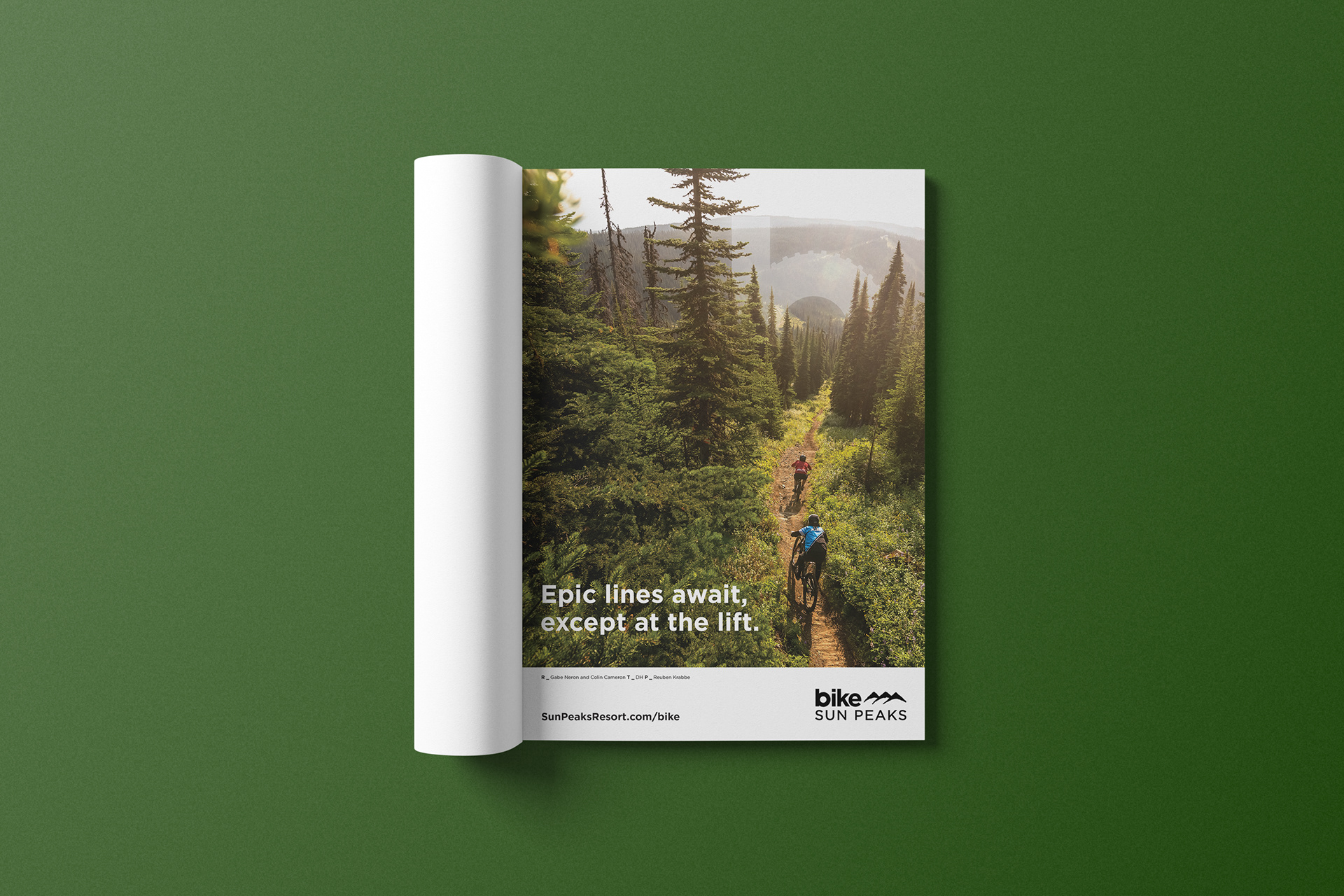
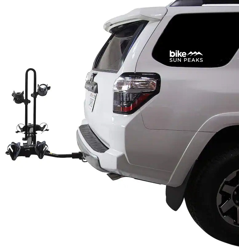

With exceptional growth and investment, Sun Peaks Bike Park needed a strong visual identity to match. The logo needed to incorporate the parent Sun Peaks name, the bike product along with the 3 Peaks icon. Careful consideration of hierarchy, font choice and the need for simplicity to replicate the logo on everything from signs to stickers was taken into account. Lowercase lettering, along with tire treads along the b was created to respresent a playful, outgoing and adventurous park.